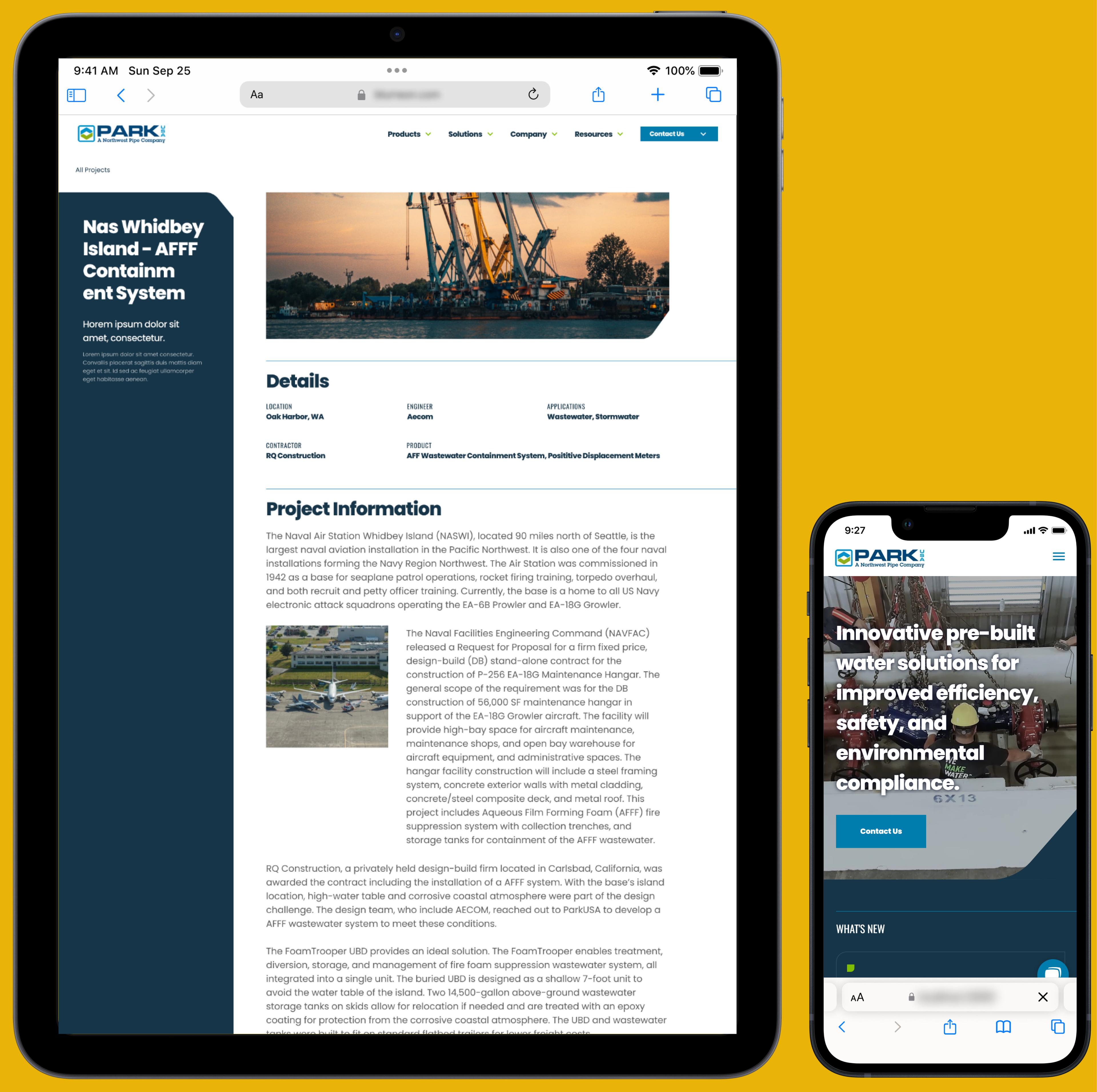
Website Redesign for Park USA
Impact
WCAG AA Visual Contrast Compliance
Skills & Industries
Overview
ParkUSA offers innovative pre-built water solutions for improved efficiency, safety, and environmental compliance. I spearheaded product design and creative direction to deliver a component system and complete website re-design for Park USA. Additionally, my colleague and I managed deliverable scopes and presented directly to stakeholders to process feedback and supervise timeline goals.
Discovery
My colleague and I co-facilitated a workshop to identify client problems, requirements, expectations, and any data they could provide to measure goals. By leveraging Miro, we collaborated with the client to outline major areas of improvement for the current website and overall deliverables for the project. Post-workshop, I drafted the initial sitemap and primary user flow, which reflected user goals.
Findings
Outdated design.
Inconsistent design between pages.
Difficulty managing content or pages.
Poor communication of services.
Limited platform functionality.
Poor responsive design.
Failed WCAG compliance


Challenges
Their feature-heavy website would be a challenge to overhaul. Under the WordPress platform, content management was necessary across several media types. Additionally, a dynamic, site-wide search would allow users to find any of the scoped media, so UI would need to adapt accordingly.
Key Challenges
Broad taxonomy.
Diverse and adaptable component system.
Elevated design expectations.
Limited platform.
Lastly, despite limitations that persisted with WordPress and Elementor, the client provided exceptional design references regarding their visual design goals. Alignment with engineering was critical to meet client expectations and remain within budget.
Methodology
As we established pages with content and functionally (new and old), I approached this from a proactive standpoint, planning the system to be economical. The goal here was to provide a system that was as concise as possible while meeting functional needs across the new site.
Design System Discovery Process
Audit all new pages.
Audit all sections and functionality from new pages.
Consolidate elements to define design system foundation.
Secondary research and competitive analysis of complex functionality.

I iterated closely with my team to ensure components were reasonable (programmatically and time-wise) on the WordPress platform. Once receiving client approval on the design system, I leveraged Figma to create wireframe prototypes for all components, including variable conditions for breakpoints, interaction states, and size variants. Throughout the design phase, this molecular approach encouraged rapid refinement of wireframe pages into fully designed, adaptive prototypes.


For WCAG compliance, I meticulously gathered alternate pairs of the ParkUSA brand colors and facilitated several iterations to nail down a consensus from their team. While educating WCAG levels and effectiveness, I outlined details that would affect compliance and provided solutions to avoid negative impact.
When focusing on messaging, I proposed clear and concise language to communicate their unique benefit to their audience. Large chunks of descriptive copy would daunt users, so I encouraged less body copy and added larger headings that allowed users to scan for their goals.


During quality assurance, I assisted by providing HTML/CSS solutions for visual issues and adjusting image optimization for performance improvements.
Retrospective
Despite a learning curve, moving to the WordPress platform expedited their content management process while allowing them to scale when needed. In addition, while we did not achieve full WCAG approval, we achieved AA compliance for visual contrast. The experience was an exciting opportunity to expand my knowledge about the ins and outs of a new industry. Moreover, I learned more about the limitations of WordPress plugins and methods of designing around them to perform as a better collaborator.